Guide to the user interface
This page exaplains the terminology used in the help which refers to the commonly occurring components of the StrataBugs v2 graphical user interface.
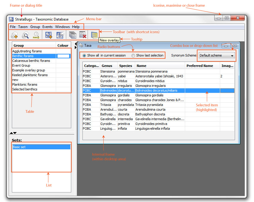
Frame |
The main "window" for each application. It may be subdivided into panes (typically left and right) and these may be tabbed, scrollable or both. Most frames have a menu bar and toolbar.
 Taxanomic Database and Samples & Interpretations both have split panes; you can change the proportion of the screen given over to each pane by dragging the dividing bar. You can minimise or maximise it by pressing the arrow buttons. Taxanomic Database and Samples & Interpretations both have split panes; you can change the proportion of the screen given over to each pane by dragging the dividing bar. You can minimise or maximise it by pressing the arrow buttons.
|
Dialog |
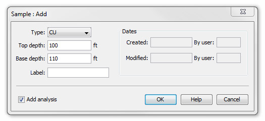
Requests information about a task you are performing or which supplies information you may need. Dialog boxes may contain text fields into which you type information, Combo boxes, Buttons, Radio Buttons and Check Boxes. Tabbed dialog boxes have a series of tabs on the top edge, each of which provides a separate set of options.
A dialog may be modal - i.e. you must close it before you can continue - or modeless i.e. you can continue to use the system while the dialog remains open.
|
OK, Cancel, Close buttons |
There are three ways to close a dialog:
OK closes the active dialog and save any data changes you have made.
Cancel closes the active dialog without saving any data changes you have made
Close closes a modelss dialog or a dialog where no changes can be made |
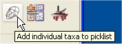
Tooltip |
Text messages which explain the function of a component - in this case shortcut icons. Tooltips appear when you hover the cursor over a component.
 |
Buttons |
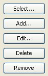
Press a button to initiate an action indicated on its label . A label followed by "..." indicates that another dialog will open.
Buttons labelled Select, Add, Edit and Delete have fairly predictable outcomes and are only mentioned in the help where some ambiguity about the consequences of using them may arise. The function of other buttons is documented as the need arises. |
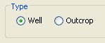
Radio (or option) button |
Radio Buttons present two or more mutually exclusive options. You must select one of them.
 |
Check box |
 Check boxes are not mutually exclusive. Check boxes are not mutually exclusive.
|
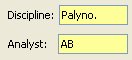
Text field |
Fields into which text is typed. In this example the fields are search fields The % sign (wildcard character) is a device which appears by default in search fields and which replaces any number of characters in a string so that you can search for items without entering the full name. Additional wildcards can be positioned anywhere within the character string in each field. Removing a wildcard from any search field and leaving it blank will result in no items being found.
 Yellow or grey text fiends are not editable and only display information. Yellow or grey text fiends are not editable and only display information.
|
Combo Box or Drop down list |
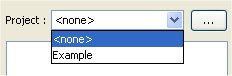 Presents a list of available choices. Press the down arrow to the righthand side of the field and select an item from the list. In this example there is also an ellipsis (...) button which will open another dialog with a greater selection of items to choose from. Presents a list of available choices. Press the down arrow to the righthand side of the field and select an item from the list. In this example there is also an ellipsis (...) button which will open another dialog with a greater selection of items to choose from.
|
Spinner |
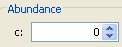 Lets you type in a number and/or increment or decrement the number by pressing the up and down arrows. Lets you type in a number and/or increment or decrement the number by pressing the up and down arrows.
|
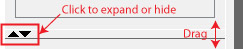
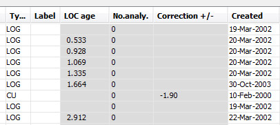
Table |
Tables display database data. Some tables let you edit data.
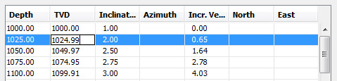
| Grey cells indicate data which has been derived from other data, i.e. which does not exist as an item in your database. Here, for example, the LOC ages for each sample are calculated from LOC data. |
|
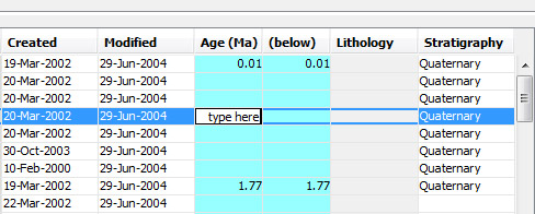
| Cyan cells indicate that you can edit them by doulbe-clicking in the cell. You MUST press enter after typing to save data. If the cell is outlined in red, what you typed is not legal data. |
|
| Some tables with white cells are fully editable, i.e. if you double-click in any cell you can edit its contents. |
|
| Blue cells indicate that you can edit without double-clicking in a cell. You can also navigrate around using your arrow keys, and you do not have to press enter to confirm every data entry. |
|
|
Choose - Double click on an item by clicking when the mouse pointer is over it to initiate an action.
Click - Press and release the left (default) mouse button.
Drag - Select an item by pressing and holding the left (default) mouse button, moving the pointer to the new location and then releasing the mouse button.
Double click - Click twice in rapid succession.
Press - Click when the mouse pointer is over a command button.
Select - Mark an item by clicking when the mouse pointer is over it; this usually highlights the item but does not initiate an action.
Cancel - Closes dialog but any changes are not saved
Close - Closes dialog. Generally dialogs with 'close' buttons are for information only do not allow you to make data changes; or, changes have already been saved at this point.
OK - Closes dialog and saves changes to the database
Delete - Permanently deletes selected items from the database. Usually you will have to confirm that you want to permanently delete data..
Remove - Removes selected data but does not affect the database
Exclude - When matching data, excluded items will not be imported from the workspace to the database.
(...) - Press to open a dialog box containing further options
Dimmed or greyed button or menu item -
Not available to you at this time.
Check/Checkbox - A check (tick or cross) next to a menu item or in a checkbox shows that it is selected.
Page last updated: 03-Dec-2014 15:57