| << Previous | Learning Trail | Contents | Section 7: Charts | Next >> |
| StrataBugs Learning Trail | Section 7: Charts |
Biostratigraphy Panel Properties
The biostratigraphy panel can provide many "views" onto the raw analysis data. There are several example templates for biostratigraphy panels which you can download and import.
Health warning: while (almost) all combinations of filters, groups and styles are permitted, they are not all enlightening or sensible!
Outer and Inner Panels
The biostratigraphy panel template consists of one or more inner panels. The inner panels come in three 'flavours': taxon, analyses and clustering. Each inner panel has its own editable properties. Another set of properties applies to the whole template (all of the inner panels) - these are the 'outer panel properties'.
By default a taxon inner panel is displayed. This can be deleted if not required. To add a new inner panel of any 'flavour' select the ![]() icon.
icon.
Outer panel propertiesBoth the inner and outer panels may display restricted sets of data. Only data included in the outer panel can be included in the inner panels, though they may filter it further. By default the outer panel includes all data from the discipline. If you select a Group set filter, only occurrences of taxa within groups in that set will be included in the display. The inner panels all display the same list of analyses. Filter this list by restricting the sample types, analysts and suite numbers to be included. The samples/analyses can be distributed to ensure that analyses which are close together do not overplot, even at a condensed scale. Occasionally this may not be desirable - see below for effect on interpretations and events. You can show an alphabetic key to make it easier to locate individual species. The key includes and alphabetises all species or curve names from all the inner panels. Select a synonym scheme to plot preferred taxon names. | 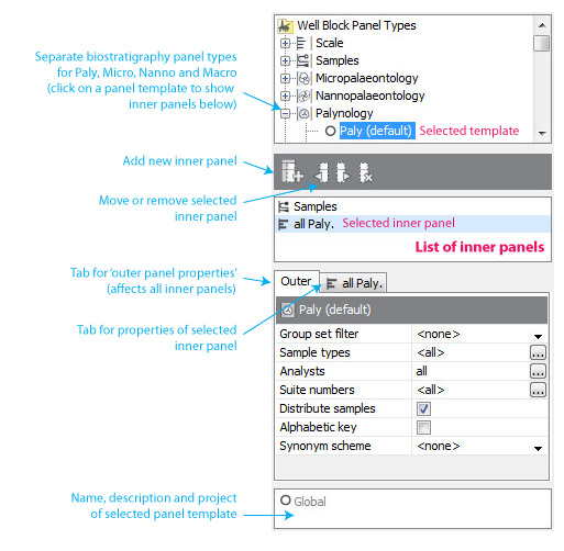 |
Taxon inner panels
The list in the upper pane shows the inner panels (each type has a different icon). Click on an item in this list to show its properties tab below.
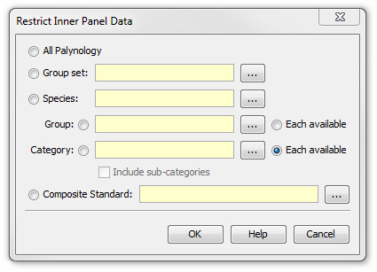
Taxon inner panels can be Restricted to show only certain occurrences. Clicking next to this option in the table shows the dialog pictured left. An inner panel may show all the data from the discipline, or just species from a group set, group or category. It can also display just one species. Selecting a composite standard will restrict the panel to taxa which are linked to events which appear in that composite.
For groups and categories, there is also an Each available option. With this button selected, a chart will show one inner panel per available group or category. The number of inner panels will vary according to the data context. Inner panels may be added or removed if the occurrence data change. This makes one panel template more reusable. All of the generated inner panels will share the same properties.
The outer must have a group set filter selected in order to select the "each available group" option.
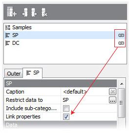 |
All inner panels have their own set of properties. You may however choose to 'link' the properties of each inner panel type, to make editing easier. Inner panels which are sharing properties display a chain link symbol in the list. To 'unlink' the inner panels and edit their properties independently, uncheck the Link properties option in the properties table. |
Data - what to plot?
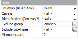
The inner panel plots any data which are included in the outer panel (e.g. the whole discipline, or a group set), and also included in its own filter (see above).
Qualified (reworked, caved or questionable) occurrences are by default included in the display and calculations. Use the drop-down lists to include only qualified or unqualified occurrences.
You may choose to exclude taxa from a group.
Occurrences of all sub-types are included by default. You may choose to specify one or more sub-types to which the occurrences must belong, by clicking the ellipsis (...) in the sub-types field and selecting one or more sub-types. Note that the default "<no sub-type>" counts as a sub-type!
Occurrences with a count lower than the minimum count will be excluded from calculations and display (output values, e.g. weight-normalised count, are not excluded). Note that "outside the count" is equivalent to a count of 0, so to exclude "outside the count" occurrences you should set the minimum count to 1.
Abundance - how is it calculated?
The abundance options are as follows:
- Quantitative - use the total count for each occurrence. Counts for any semi-quant data will be derived using the output value from the linked abundance scheme.
- Quant/Semi-quant (mixed) - use total counts for quantitative data, and ignore semi-quant data in calculations. Semi-quant abbreviations will be plotted as labels where there are semi-quant data.
- Semi-quantitative - plots a spindle-type symbol to represent semi-quantitative abundance. The width of the spindle is based on the rank of the abundance value in the scheme; the highest rank in the scheme shows a square symbol. The symbols for each scheme can be shown in the key. For quantitative data, the rank number is derived using the total count and the output values in the abundance scheme. For this reason, abundance schemes must be set even for suites where there are no semi-quant data (although each suite may use a different scheme, in which case spindle widths are normalised across schemes).
Where a track contains data from multiple occurrences (e.g. when grouping by category, or when reworked and in-situ occurrences are considered in the same track), the width of the spindle is based on the average abundance. For example, if the "adult" sub-type of species X is Rare (output 5), and the "juvenile" sub-type is Abundant (output 15), the spindle for species X could represent Common (output 10).
Other display styles are permitted for semi-quant abundance, but a classic semi-quantitative diagram uses the individual trace style, spindles and absolute abundance (see 'Style' tab below). - Presence/Absence plots a semi-quant style diagram with a single symbol size representing presence in any abundance. Other display styles are not permitted.
 |
An example of a semi-quant chart. |
 |
|
Split factors can be applied to the counted data. Split factors are set for each analysis. The count for each size fraction is multiplied by the split factor for that fraction. Choose to normalise to a standard sample weight to make abundance values comparable across samples of different weights. Set the weight for each analysis. If an analysis has no weight set, the count will be unchanged. The example right shows two panels displaying the same data; the left-hand panel is not normalised to weight, the right-hand panel is. |
Grouping - how are the data sub-divided?
The outer panel's data may already be divided into inner panels. Each panel then splits the data further into curves. Each curve may be plotted in its own column, or stacked on top of the previous curve (see Style below).
The Group data by option answers the question "what does each curve represent"? In the simplest case, data are grouped by species, so that every curve represents a cumulative count of occurrences of one species.
If you choose to group by taxon group, the outer or inner panel must be filtered by a set, so that the panel knows which groups to use. If a species occurs in more than one group in this set, it will only be plotted in the first group curve - for this reason it is not recommended to repeat taxa in group sets.
Furthermore, you can sub-divide each curve by situation, confidence, sub-type or size fraction. You can only do this for the 'Individual' plot type (see below), and the quantitative or mixed abundance styles. Note also that you cannot use the 'species richness' calculation style if you sub-group by size fraction.
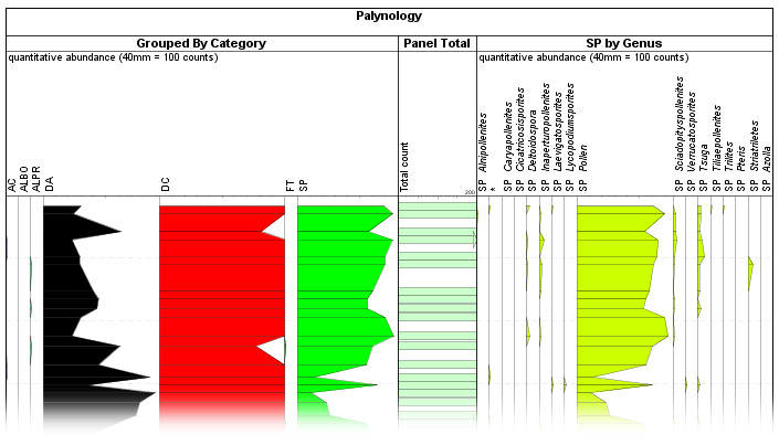
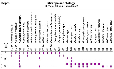
Showing from left to right inner panels grouped by category, panel total and genus.
Style - what type of plot?
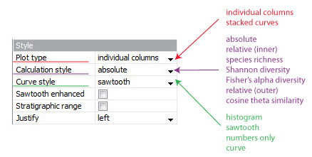
The plot type determines whether each 'curve' is plotted in its own column, or stacked on top of the last curve. Some data lends itself well to one type - e.g. it doesn't usually make sense to stack curves representing species, whilst is does make sense to stack up the reworked and in-situ components of one species.
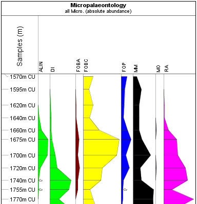
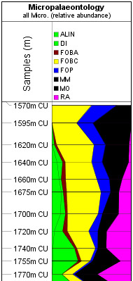
The simplest calculation is absolute abundance. There are two types of relative abundance. In % of inner panel, the value is the percentage of the total for all the curves at the analysis point, such that all the values across the column total 100% (see 3 below). In % outer panel, the total used includes any data which would be included by the outer panel's filters. Note that this includes all types of occurrences, even if they are excluded from the inner panel (e.g. by reworking).
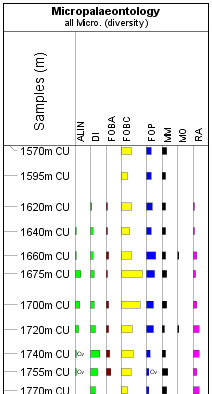
For species richness plots, each species is given a count of 1, rather than its abundance, so the totals give equal weight to all species (this has no effect when you group by species). Diversity can be calculated using the Shannon index, which takes into account both species richness and evenness, or Fisher's alpha. Note the values from both diversity calculations are typically low (e.g. 1.5 and 3.5), so you may wish to change the scale in the Options section. You cannot plot diversity when the data are grouped by species, sub-grouped, or stacked.
Cosine theta similarity is a measure of the similarity between adjacent analyses (the number of values is one fewer than the number of analyses; the first analysis has no value). Values range between 0 (completely dissimilar) and 1 (identical). Note that whether neither analysis contains taxa, the plotted value is 0 (but with no label). Thus while "similar" values (closer to 1) can only be generated by analyses with similar compositions, low values may be generated by genuinely different compositions OR barren analyses.
Different datasets may warrant the use of histogram or sawtooth type plots. Either type may be justified left, right or centre (note that centre-justified histogram was previously referred to as "spindles"). You cannot centre-justify and stack any type. Similarly, you cannot stack the numbers only option (note also that the number can be displayed in addition to the histogram / sawtooth / curve - see Options section). The curve style is similar to sawtooth, but unfilled. You can plot a curve of a magnified value over the sawtooth plot by checking the enhanced checkbox. This is useful if you cannot select an appropriate scale for all the data, but still want to draw attention to variation in smaller values.
Checking stratigraphic range plots a thin vertical line indicating the total stratigraphic range for each track. Arrows indicate where the stratigraphic range continues above or below the chart range. You can show stratigraphic range for all the curve styles.
Here are some examples, all plotted with the same data set, which is not filtered and is grouped by category.
| 1. Histogram plot of species richness in different columns. | 2. Sawtooth plot of absolute abundance in individual columns | 3. Stacked sawtooth plot showing relative abundance |
 |
 |
 |
Options
By default, tracks are sorted by first downhole occurrence (with secondary sorting by last uphole occurrence). You can reverse this (first uphole occurrence) or show species in alphabetical order. If you have restricted the panel data to a composite standard and grouped by species, you can also sort by event age. There will be one curve for each event in the composite standard (the curve data show the abundance of the event's taxon). The curves are sorted in ascending event age. Some taxa may be repeated (e.g. where the composite includes both top and base events) and for this reason you cannot use relative calculation styles. Showing stratigraphic range, selecting a composite for the header and showing events (see both below) pair well with this option. You can use the plot to highlight occurrences which are out of place stratigraphically (and therefore possibly reworked), and also to pick stratigraphically significant abundance events.
The horizontal scale is the scale limit divided by the default column width. Thus in this example, 0.4mm represents 1 count. No column will be plotted narrower than the minimum width. Values over the scale limit are shown by an arrow (histograms) or a cut-off (sawtooth).
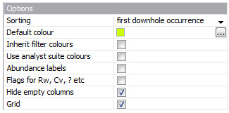
The default colour is used where a colour cannot be sourced from the column data type (e.g. groups have set colours, while individual species do not - if you group by group (i.e. columns are groups), the group colour is used, but if you group by species, the default colour is used instead). Inheriting the filter colour will override the default colour in cases where the inner panel uses a data filter with a colour (i.e. a category or group). You can override the default colour with the suite colours if you wish, to distinguish different sets of analyses (note this is not applicable to the sawtooth or curve plot styles). You might wish to colour the labels or leave them black.
Some tracks may appear empty because their data is outside the chart's depth range, or because all occurrences in them are excluded (e.g. all occurrences are reworked and reworking is not included in the panel data). Empty tracks are hidden by default; you can show them by checking show tracks which are outside panel range.
The grid is a simple visual depth guide. Note that you may experience a dip in scrolling performance when displaying the grid - try turning it off if you experience slow or jumpy scrolling.
Images
 |
The images column can be plotted to the right of the occurrences data, and shows the first image in the image set (if it exists) of any occurrence displayed in the panel (note this is affected by settings on the Data tab). You may wish to plot only images from 'marker' occurrences to save space in the panel. Increasing the column width makes the images larger. |
Header
 |
You can change the style of the taxon name display to suit the space available. The highlight taxon group options allow you to select a taxon group and a colour with which to highlight it in the chart. The taxon name in the header and the chart data will both be coloured. Note that this will only have effect if the plot style is set to 'individual' and the grouping is set to 'species'. |
Use the options in the Derive age and unit box to display, in the panel header, an age range and stratigraphic unit associated with each 'curve'. This will be displayed if:
|
 |
Interpretations
Viewing interpretations on the biostratigraphy panel enables you to cross-check your interpretation with the raw data. The version will be inherited from the block.
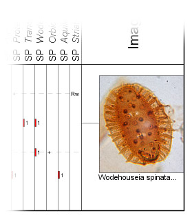
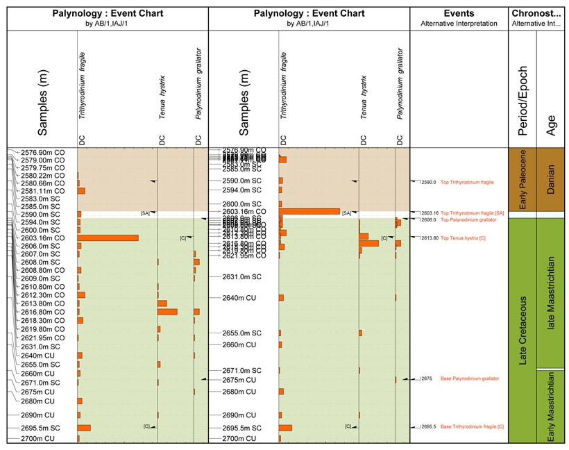
Events can be shown if the panel grouping is by species, and the curves are not stacked. Events are plotted if the event taxon matches a curve on the panel. The arrow symbol indicates the type of event. The event name is not plotted if it matches the taxon name exactly.
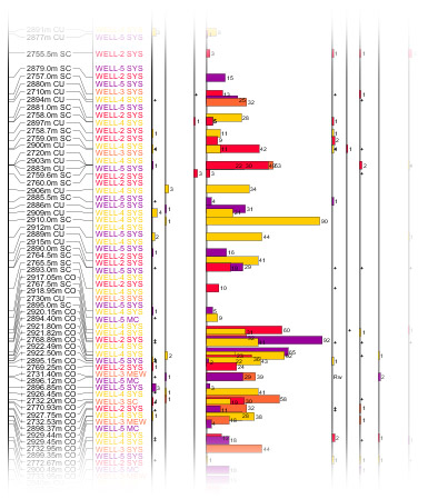
Note from the example below that events are plotted at their true position (accounting for core shifts). The biostratigraphy curve data is not always shown at its true position, particularly where there are many analyses in a small depth range, because the analyses are distributed to prevent overplotting. This attribute of the outer panel can be set on the outer panel tab (see above).
When the analyses are distributed it may appear that events are picked at the wrong depths, when in fact they are not. In the example below, the 'Trithynodinium fragile [SA]' event is picked at sample 2603.16 CO, on which the analysis by IAJ, which shows very high abundance, is also based. This is apparent in the right-hand panel, where the analyses are not distributed. Also try changing the depth scale of the chart to align the event symbols with the appropriate analyses.
Background colours from a scheme can be set on the Chart Properties dialog.
Clustering Inner Panels
This inner panel type displays the results of clustering analysis using the CONISS method. The example below shows the "dendrograms" for one section - on the left for all the Micro species, then including only agglutinating forams (FOBA category) and calcareous forams (FOBC).
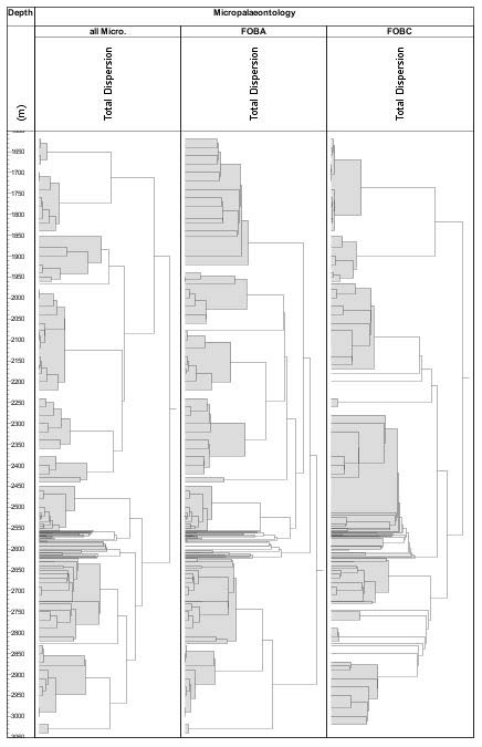
The method used is the constrained incremental sum of squares method (CONISS) of Grimm, 1987. The value for each taxon in each sample in the selected data is first calculated as a proportion of its abundance throughout the depth interval. All the occurrence types for the same taxon are added together i.e. if there are a number of questionable occurrences and reworked occurrences of a taxon, and if these are selected to be included, the proportion will be calculated from the sum of the abundance of all these occurrence types. Each proportion is then recalculated to its square root. Next, the difference between the proportion of each taxon in each successive sample is accumulated for a sample, and the smallest sample differences are added together to form a cluster. The process then repeats, comparing successive clusters until all the data merge.
The dendrogram displays the dispersion, or relative differences, between the clusters. A larger dispersion implies a greater difference between samples/clusters. The application only offers constrained comparison between adjacent samples, so cannot be used to determine stratigraphic order from randomly sorted samples.
Biostrat Panels in Project Blocks
You can plot any of your biostratigraphy panels in a project block. Here the list of analyses will include analyses from all wells in the project. You should consider the following points:
- A "project distribution" panel potentially contains a very large amount of data. Expect the chart to take time to load, and also to update when the template is edited.
- In order to compare sample depths across wells, Project blocks can be plotted on an age scale or a TVD scale. For either of these scale types the block requires a means of translating between measured depth (native sample depths) and the chosen scale type. For TVD plots, this is the well's deviation survey. Note that if there is no survey, measured depth will be used instead, but you should be wary of comparing wells on this basis! For age plots, the means of translation is each well's depth/age curve (taken from the panel's version). You will not see any samples which fall outside the range of the curve.
- It is usually better to switch off the "distribute analyses" option on the outer panel.
- You can use colours to differentiate between wells:
- Assign colours to wells - do this by editing the well in the Wells & Outcrops module
- In the inner panel properties, select the option to "use analyst suite colours" (Options section). The analyst suite colours will be replaced by the well colours.
Overplot
 You can layer taxon inner panels on top of each other in order to create a more compact panel.
- All the overplotted panels must use the "individual columns" track style.
- They must use the same data settings, grouping and order. This means that the overplotted panel's columns will align exactly with the columns in panels underneath. You can only edit these properties in the bottom panel, and doing so will affect all overplotted panels.
- Any empty columns which are hidden in the bottom panel will also be hidden in the higher panels (even if they are not empty).
- No overplotted panels can use the linked properties.
For a successful plot, consider the following:
- The overplotted panels may use different calculation styles. For example, you could show species richness over the total abundance.
- The overplotted panel may use different scales. This is essential, for example, if you wish to use a diversity index (which has small values) on top of quantitative abundance. You could also use it to show large values and small values in the same column - similar to the "enhanced sawtooth" option.
- The "curve" plot style is useful because you can see the data beneath.
- Use the "inherit filter colour" option to control colours.
- Use the "colour labels and flags" option to indicate which labels belong to which data.
 |
In this example (properties table is shown above), the left-hand panel shows quantitative abundance of some radiolarian species. The right-hand inner panel (in black) shows the total count of microfossils for each analysis. The blue overplotted panel shows the abundance of each species as a percentage of all microfossils (calc style "% outer"). The overplotted panel uses the curve style with a different colour and no labels. |
Page last updated: 14-Jan-2019 15:42