Month: May 2016
Why doesn’t StrataBugs always look right?
You get a shiny new computer with a nice high resolution screen but when you start up StrataBugs, the text font looks too small so you can hardly read it, and some windows are clipped so you can’t see everything that’s supposed to be there without enlarging it. Moreover, every time you get a simple dialog box pop-up, the icon, instead of looking like this:
 (Windows 7, 100%)
is clipped, like this:
 (Windows 10, 125%)
So, what’s going on? Well, it’s possible in Windows to set your display preferences so that text fonts and other windows components are made larger and more readable, without sacrificing the overall number of pixels available on screen (unlike, say, lowering the overall screen resolution, which doesn’t look good on modern flat screen monitors). As higher resolution monitors have become the norm, the default settings on a new Windows installation is actually for this preference to be set to 125%, so you might already have enlarged text without realising it. The problem is that a lot of software, and this includes the Java library code that StrataBugs uses, doesn’t respond in a uniform way to the font size change, resulting in the general loss of beauty described above.
In general, if you’re running a recent update of StrataBugs, you will have seen that the text is reduced in size compared to the general Windows font sizes, so that the text and other components fit into the StrataBugs windows as they are designed. Older builds (including v2.0), will have parts of some of the dialogs missing, where the window is too small to accommodate the enlarged controls. We’ve been tweaking things again recently, to get around the tiny menu font sizes and the clipping you see above, which makes life a bit easier on the eyes.
We would also recommend that you don’t opt for the ultra high resolution 4K screens for Windows, as the application will look tiny, however this doesn’t affect the Mac community, as the scaling for their Retina displays is already built into the libraries. We’ve always bemoaned the lack of pixels available on standard issue laptops with a resolution of 1366 x 768, which is the bare minimum of space you need. More pixels are definitely better, as long as you can still read it.
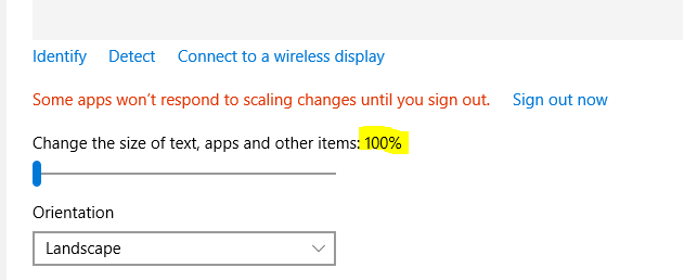
The best solution, for now, is to right-click on your desktop background, select Display Preferences and reset the size to 100% ….
You might find this a bit tricky to start with, but you might also like the extra screen “real estate” that this gives you. If after a while you still find yourself squinting at the screen, try moving your chair closer, or visit an optician and invest in a new pair of glasses!
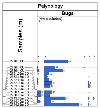
Why are my analyses plotting at the wrong depth?
A couple of people have stumbled over this one in recent weeks. No “bug bounties” I’m afraid folks – this behaviour is intentional. Honestly, it’s not a bug, it’s a feature!
In a high precision study, you may have analysed many samples within a small depth range. If the occurrence data were plotted at the exact analysis depth, then all the histograms and labels would plot on top of each other.
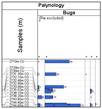
This can make it difficult to see the finer detail. In order to get around this problem, we ‘distribute’ the analyses into the surrounding empty space, such that each data point is readable.