Webinar dates for sessions 4 and 5
Thank you all for attending the webinar series so far. There will be a break next week, so the repeat of session 4 on a Tuesday will take place on the 2nd May 16.30 BST, registration link here. Session 4 will cover chart basics, how the templates work together, how to construct, use and edit templates to create charts.
Session 5 will extend the charts session and discuss maps, creating map blocks and layer templates. The first webinar of session 5 will be on Thursday 4th May at 10.00 BST, registration link here.
Should groups contain only unique taxa?
Taxon groups in StrataBugs can contain any number of species (or genera, since v2.1). Groups can be added to a Group Set, which allows the relative proportion of the taxa in each group to be plotted, often in the form of compact “closure” diagrams that show stratigraphic or environmental trends. So far so good. We’ve pretty much assumed that, up until now, a Group Set will contain an exclusive set of taxa; i.e. each taxon will only occur in one group, when that group belongs to a Set. Indeed, when you create or edit a Set in the Taxonomic Database module, it warns you if there is any duplication between the groups, and allows you to see the duplicates:
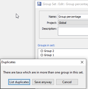
But what happens when a taxon belongs to more than one group in the Set? What if you have groups that reflect broad environmental conditions, and some taxa are present in a range of environments which spread across more than one group? To display these groups as a relative abundance curve would be to double count the abundance of taxa in each group. But to include them in some groups and exclude them from others seems arbitrary. Up until now, the latter is what has happened in the v2.1 charts, and this has been inconsistent with the previous behaviour in the “legacy” charts. In the “legacy” charts, each taxon was added to the total for each group, so if a Group Set was plotted with relative group abundance, those groups with duplicate taxa would be more heavily weighted compared to the other groups. In the v2.1 charts, the taxon is only counted once – but this has the distorting effect of ignoring the influence of the taxon in any subsequent group it might appear in.
I think a better solution exists than either of these scenarios. If a taxon exists in more than one group, then perhaps the weighting of that taxon’s abundance should reflect the number of groups that it is spread between. So if it occurs in two groups, then 50% of the count gets allocated to each group. We have just updated the v2.1.1 (and v2.1.1-14) release to reflect this new thinking.
Let’s look at a simple example to illustrate the change. Suppose we have two groups; Group 1 and Group 2. Group 1 contains one taxon (Ammonia spp.); Group 2 contains 2 taxa, Ammonia spp. again, and Elphidium spp. Both taxa are recorded in an analysis, each with a count of 10 specimens. The total count is 20 specimens. Let’s start by plotting this in the legacy chart application:
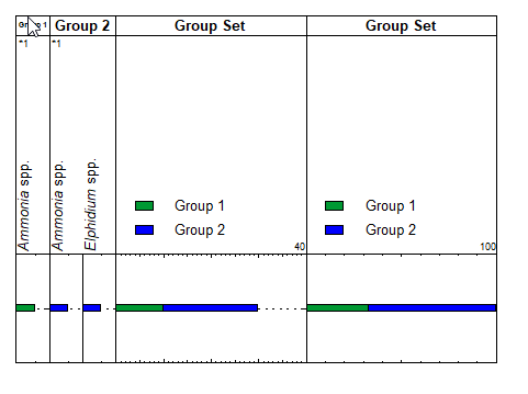
The first panels, Group 1 and Group 2 plot as expected: an abundance of 10 for each specimen. No problem there. In the third panel, showing the Group Set, the duplicate taxon in Group 2 is counted twice, so although the panel looks reasonable, the total count displayed here is 30 – whereas the true total count is only 20. The fourth panel, the relative abundance of the groups within the Set, also looks quite reasonable, but the proportions don’t correctly reflect the proportions of the contents of the groups.
Now we plot the same data in the unmodified v2.1 charts:
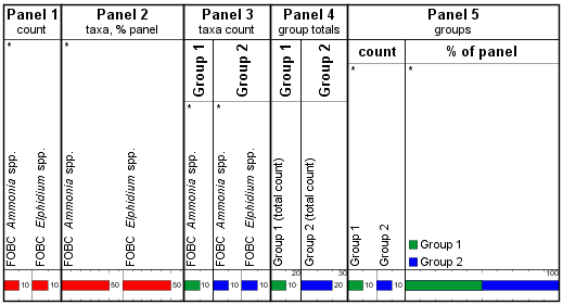
Panel 1 shows the individual taxon abundance; Panel 2 shows the abundance of each taxon as % of the total. Panels 3 and 4 have inner panels for each group, and show the count of individual taxa in the group and the group totals respectively. Ammonia spp. contributes to the count in both groups. The inner panels in Panel 5 each show the Group Set, divided by its constituent groups. Now we see an equal count (and % distribution) of Groups 1 and 2, because Ammonia has been counted in Group 1, and isn’t counted again for Group 2. This is different to the “legacy” chart above, but still does not accurately reflect the group proportions.
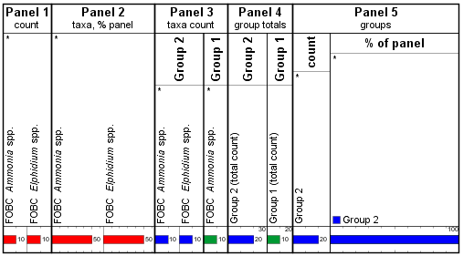
Worse, when we rearrange the Set’s group order, so that Group 2 is now plotted first, we see Group 1 disappearing completely in Panel 5:
In the modified version which is now released, we divide the abundance between split groups, so we get this:
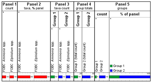
Panels 1-4 are the identical, but Panel 5, which shows the Group Set as a whole, has the 10 counts of Ammonia split between Groups 1 and 2. This means the total of the absolute abundances is (correctly) 20, and Group 1 only has 25% of the weight (as opposed to 33% in the legacy charts, and 50% – 0% in the previous version). The proportions remain the same when the groups are reordered. This also highlights the subtle but important distinction between plotting separate inner panels for each group (as in 3 and 4) compared to separate tracks for each group (as in each inner panel in Panel 5).
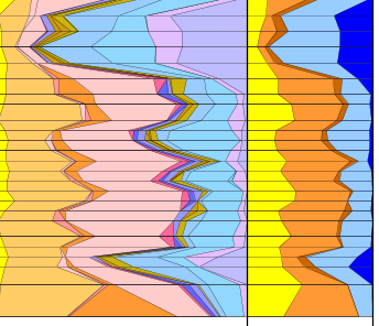
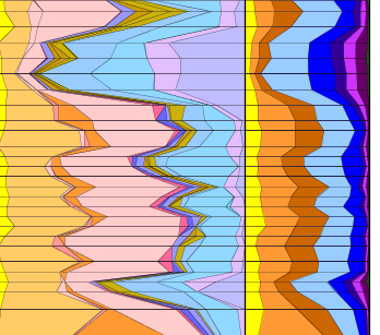
Finally, a real world example. This Group Set contains several hundred species which are ranged across different water depths. The left panel reflects unique group assignments: taxa ranging across environments are assigned to a group which exclusively contains taxa of the same range. It is difficult to get the group ordering right, with overlapping ranges, and the colour assignments can subtly affect the visual result. In the second panel, where there are fewer groups but taxa can occur in multiple groups, the deeper water depths are under represented.
When we display the same panels with the modified version, we see a more even spread across the main groups:
This issue only affects you if you use overlapping groups, so may not be a big deal, but perhaps some explanation of what’s going on here is useful, and it can be an opportunity to more easily group taxa for displays of this kind.
Your head’s probably spinning by now and you probably wish you’d never started reading this, but if you’ve lasted out until the end, and feel the urge to comment, we’d welcome any feedback.
StrataBugs v2.1.1 – overriding well block templates in individual wells
Some months ago we started to work on an improvement to the new charts system to address what seemed to be a very common question: “Can I just change this panel in this one well?” The results are now available to everyone in version 2.1.1.
Recap on well block templates
A block template is an ordered list of panel templates, with captions. It is a saved design layout, usually belonging to one project, which can be used to display data from any well. It makes sense to be able create a standardised chart for each well in a project, especially where the different wells have similar data content which might be need to analysed or displayed in the same way. Because “charts” are always coupled to their templates, you can change your mind about the layout or design without having to edit a chart for every single well – just make the change to the template, and all your charts will be updated. This is far cleaner and more flexible than having separate charts for each well (as was the process in the old charts model).
So far so good, but it seems that standardisation can only go so far. Different wells have their quirks, and you need to tweak the design ever so slightly in some cases. Perhaps a different wireline log here, or a slightly different group of taxa there. In the original 2.1 charts module the only way you can do this is to duplicate the block template – probably giving it a name specific to the well for which you needed to make the tweak. Suddenly, instead of having one block template which is neatly shared around the project, you’ve got a separate “template” for each well and you’ve lost all the benefits of having templates in the first place.
New overrides feature
We wanted to allow the flexibility to tweak chart design for individual wells, whilst retaining the benefits of the template-driven model. Version 2.1.1 handles the complexities internally, giving you just a simple option to change some panel properties in individual wells, if you wish, and see those changes reflected wherever you use that template to display that well. You can still make changes to the base template and see them reflected everywhere.
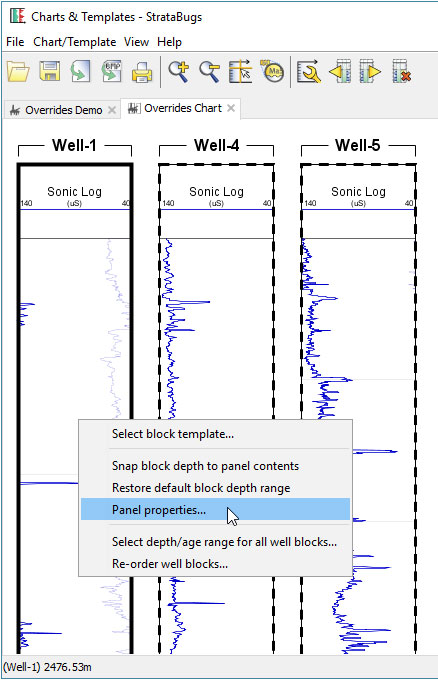
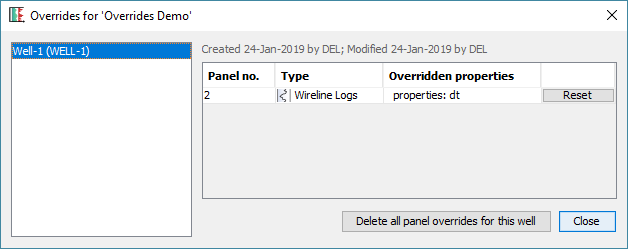
Here is a simple example. I create a well block template with one panel, showing the sonic log. I create a new chart and add some blocks for wells in my project, using my new template.
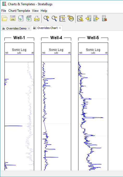
The horizontal log scale looks fine for Well-4 and Well-5, but it’s not great for Well-1. Previously I would have had to make a compromise and decided on a scale which I could use for all wells (or create a separate well block template just for Well-1). With v2.1.1 I can right-click on the panel in Well-1 and select Panel Properties:
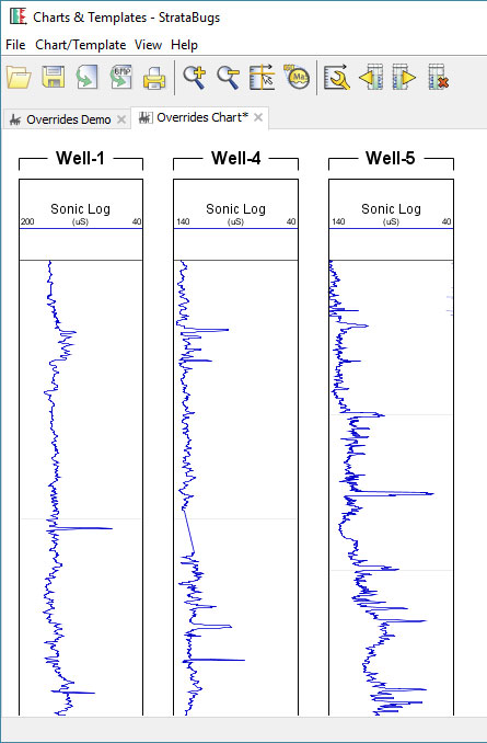
After adjusting the DT (sonic) scale, my chart is looking better.
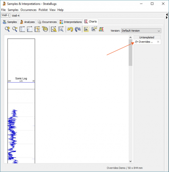
When I have saved this chart, my override for this panel for Well-1 will be saved and applied whenever else I open this template for Well-1. So if I open a tab for it in Samples & Interpretations, my new scale applies. An arrow symbol in tab indicates that this block template has panel overrides in this well.
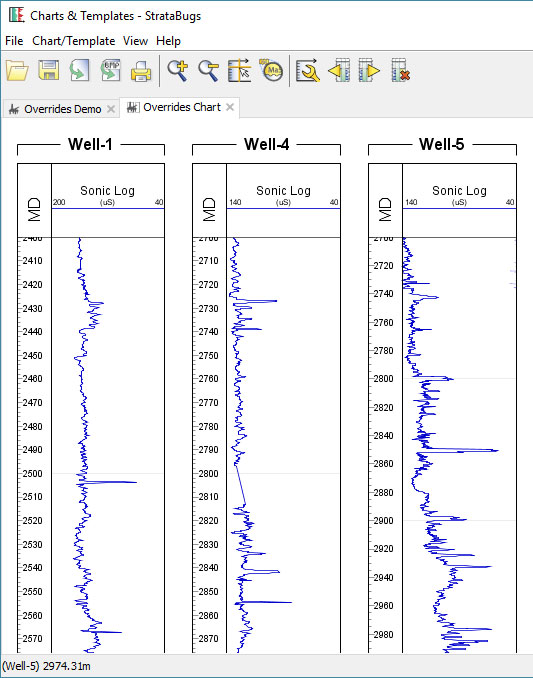
If I make a change to the block template, e.g. I add a depth scale panel, it updates for all wells.
You can see which wells have overrides (and delete them if necessary) by opening the template in Charts & Templates, and selecting Chart/Template > Overrides.
In Summary
All you have to do is right-click on any templated chart block, choose Panel Properties, and then save the resulting chart. The block template will behave differently for that well, whenever you use it. You can’t change the order of panels and you can’t add or remove them – these must be done in the underlying block template.
Don’t be tempted to make the same change to a panel for each of your wells that use a template: it’s still better to change the underlying template instead.
To use this feature you will need to be running version 2.1.1. You can download this using the normal updater (select the version at the top, and make sure you get the “Latest” release), but you will need to upgrade your database as well.
Filter by multiple categories
It has long been possible to use StrataBugs to create ‘closure’ diagrams, showing the relative abundance of different groups of species. I use the term ‘groups’ rather than ‘Groups’ intentionally, since the ‘groups’ may also be ‘categories’. A recent change has made this feature a little more flexible.
The new feature in brief
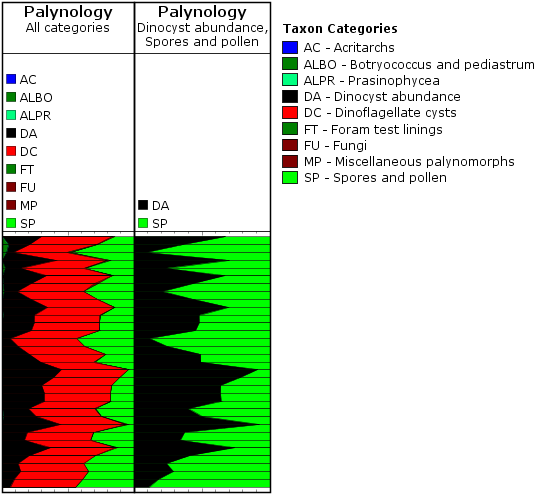
Let’s say a palynologist wants a quick overview of the relative abundance of marine vs terrestrial species. In practice this is achieved by comparing the abundance of dinocysts (category DC) with the abundance of pollen and spores (cateogry SP). Since all species belong to a category already, it’s simply a case of creating a panel which is grouped by category, and displayed as a relative stacked sawtooth plot. The only problem was that all the other palynology categories which happened to show up in the data would also be included in the plot (the left-hand panel in the image below). In the data below, the DA category represents the number of dinocysts in the first 100 specimens, so that’s what I want to compare to the SP count (N.B. your counting method might be different!).
We have now made it possible to ‘filter’ the panel by more than one category, which allows you to create the right-hand panel below comparing just DC and SP. Species not belonging to the filter categories are excluded from the data.
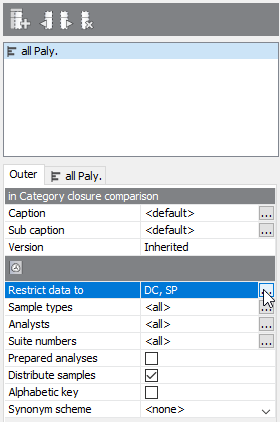
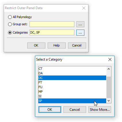
To make use of this setting, you need to select the ‘Outer’ panel properties tab, and choose ‘Restrict data to’. Here you can choose from a list of categories. To select more than one category, hold down CTRL while you select from the list.
A recap on groups and categories
All genera (and therefore species) must belong to one (and only one) category. This is a convenient way of, well, categorising taxa. Most StrataBugs users will not need to modify the standard list of categories – it would make exchanging data between databases more difficult.
Groups, on the other hand, are entirely under your control, and one species can belong to any number of groups. Groups can be attached to projects.
Both are useful for creating charts. You can find our more in the help.
More about closure diagrams
The inner panels above are created with the following options:
- ‘Group data by’ is set to ‘categories’ – this means that counts of species from the same category will be aggregated. You could also use groups here, in which case either the outer or inner panel must be filtered to a group set (which defines the selection of groups).
- ‘Plot type’ is set to ‘stacked curves’ – rather than showing the different categories in individual columns.
- ‘Calculation style’ is set to ‘relative (inner)’ which means that instead of showing the absolute count for each category, we’re showing the count as a percentage of the total for the inner panel. In this case you could also select ‘relative (outer)’ (i.e. the count is relative to the outer panel), because the inner and outer panels are showing the same data (more in this previous post).
You can find out more about the biostratigraphy panel options here.
Working with the Standard Chart
Amongst the many voices of approval from those that have got to grips with the templated charts in v2.1 there are always a few folks who are permanently wedded to the idea of “one well, one chart”, and don’t want to work in a templated view of the world. They also prefer a WYSIWIG panel property editor, so they can make individual panel changes as required for the well they’re working on. For them, getting to know the options available on the standard chart is where they need to start.
The Standard chart tab in the Samples & Interpretations module is always present, and contains a panel for all the data types that are present in the well. You can customise the standard chart by clicking in the chart properties icon in the toolbar: 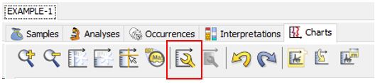 and using the panel list to add/edit and delete panels. Right clicking on any panel in the chart will bring up the option to edit the panel’s properties.
In this way you can create the chart you want. When you’re done, you can then use the rightmost button to save the chart as a template.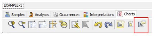
At this point you can name your template for use in the next well. Any panels that have different properties to the default will be saved in the new template.
In your second well, use the penultimate button on the toolbar to load the template you previously made into the standard chart…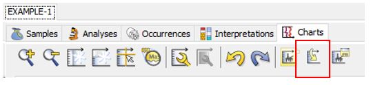
Now, make any changes you like to the panel properties. When you’re done, pres the last button again to save the template.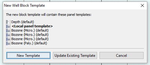 At this stage you have a choice: if you update the existing template, then this will also apply to your first well and any others that happen to be using this template. This may or may not be what you want. To keep things simple, you can select New Template, and the template name will be suffixed by the well name, and thereafter opened in a new tab bearing the template name.
When you next open your wells, the template tabs will reopen in the same state they were saved in, while the standard chart will reset to the default layout. To make changes, see above (load your template into the standard chart ….)
Lots more information on the charts tab, as always, in the help here.
Adding new zones from a chart
We try to make it as easy and ‘safe’ as possible for you to explore StrataBugs without inadvertantly corrupting your data. That’s why we always ask you to confirm before deleting something. Last week we were clicking about in this way (exploring), trying to think through an idea, when we stumbled upon a feature that we’d completely forgotten was there.
A helpful user had made a great suggestion. In their own words:
Being able to add interpretations (e.g. chronostrat) via the charts in the Samples & Interpretations module would be a very useful addition, rather than having to keep switching tabs back and forth.
The thought process on our side goes something like this: Well, yes, that would be good! How would that work? Double-click somewhere? There’s already some double-click action in the zones panel (*try double-clicking in a zones panel*) – you can edit existing zones by double-clicking on them. So, maybe double-click where there isn’t a zone? (*double-click where there’s no zone*) Hey, look, it brings up the interval dialog! So we already implemented this! (*try the same on another panel*) Oh dear, doesn’t seem to work in this panel, why’s that?
There are, literally, millions of lines of code in StrataBugs. It’s not surprising that we forget about some of them.
Go to the full post…
Abundance Events in Stratigraphic Range Charts
In recent weeks we’ve been busy enhancing the stratigraphic range chart plot to display abundance events. Many thanks to Martin Pearce at Evolution Applied for working through this with us.
The stratigraphic range panel is designed as an alternative type of view on a composite standard (event scheme). It shows the ranges of events in time.
A note on terminology: the ‘range chart’ I will be referring to is different from a ‘species distribution chart’ showing abundance variations in a well section – which I do often hear referred to as a ‘range chart’. The range chart in question is concerned with time.
A simple range chart showing a few species might look like this:
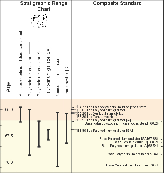
Events relating to the same species are grouped together. In this case there are three events for Palynodinium grallator – a total species range, plus two abundance event ranges.
At the moment there is no formal way to link these abundance events (denoted by the [A] and [SA]) to an abundance scheme which defines them. A simple workaround is to create an abundance scheme with exactly the same name as the composite standard. The stratigraphic range panel will pick this up and use it to identify abundance events. Any term abbreviation from the abundance scheme which appears in the event name surrounded by brackets (you may use parentheses, square or angled brackets) will be interpreted as an abundance event. Go to the full post…
Overplotting Biozones
Over the past few weeks we’ve been polishing a new feature for “overplotting” biozone panels. This feature gives you more flexibility over which biozone schemes you can include in the same columns. It was something we allowed for in the v2.1 data model but hadn’t got around to implementing yet. And yes, I am aware that “overplot” isn’t officially part of the English language, but it does describe the concept quite succinctly!
Hopefully you are already aware that:
- Biozone intervals are always linked to a scheme.
- Biozone schemes are linked to a discipline.
- There are four panel types for biozones: one for to each discipline.
- A biozone panel in a block template has a scheme attribute. When you add a panel template to a block template, you can either:
- Choose one scheme belonging to the panel’s discipline, or
- choose no scheme (“<panel per scheme>”), in which case you will see all of the intervals linked to schemes with the panel’s discipline, either merged into one column or as separate, automatically generated panels.
In short, this means you could either select all the schemes for a discipline, or one scheme only.
Adding the overplot function makes things much more flexible, giving you complete control over which intervals will appear in which columns, and even allowing you to mix disciplines. It is a simple technique (on your side anyway!) which tells one panel to draw on top of the previous panel. Go to the full post…
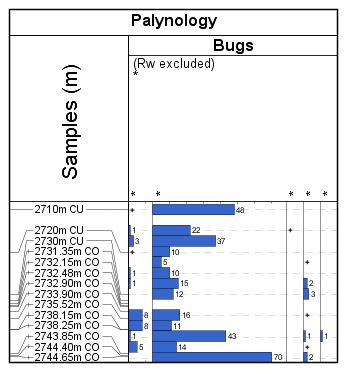
Why are my analyses plotting at the wrong depth?
A couple of people have stumbled over this one in recent weeks. No “bug bounties” I’m afraid folks – this behaviour is intentional. Honestly, it’s not a bug, it’s a feature!
In a high precision study, you may have analysed many samples within a small depth range. If the occurrence data were plotted at the exact analysis depth, then all the histograms and labels would plot on top of each other.
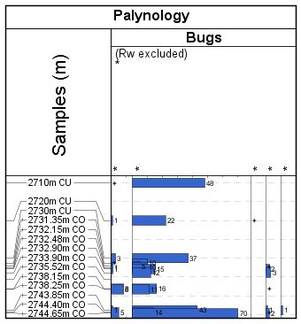
This can make it difficult to see the finer detail. In order to get around this problem, we ‘distribute’ the analyses into the surrounding empty space, such that each data point is readable.
Genera in Groups
A useful addition to StrataBugs 2.1 is the ability to include entire genera in groups. Previously if you wanted to do this, you would have had to find all the taxa from the genus (probably via a taxon search) and add them to the group. If you or a colleague added another species to the genus, you’d have to remember to add it to the group. The new system saves you this hassle and guarantees that the group stays up-to-date.
You should be familiar with the Taxon Database’s ‘Taxa’ window – this is your working list of taxa. Let me introduce you to its sister, the ‘Genus’ window. Open by choosing from the menu Taxa > Genera.
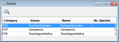
You can populate it with genera by hitting the search icon, or by dragging onto it species from any tables or lists in StrataBugs. Drag a genus from here onto the Taxa window to populate it with the member species. You can also drag the genera directly into your taxon groups. Go to the full post…