Tag: panels
Filter by multiple categories
It has long been possible to use StrataBugs to create ‘closure’ diagrams, showing the relative abundance of different groups of species. I use the term ‘groups’ rather than ‘Groups’ intentionally, since the ‘groups’ may also be ‘categories’. A recent change has made this feature a little more flexible.
The new feature in brief
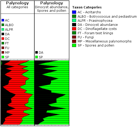
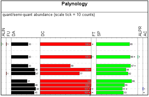
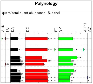
Let’s say a palynologist wants a quick overview of the relative abundance of marine vs terrestrial species. In practice this is achieved by comparing the abundance of dinocysts (category DC) with the abundance of pollen and spores (cateogry SP). Since all species belong to a category already, it’s simply a case of creating a panel which is grouped by category, and displayed as a relative stacked sawtooth plot. The only problem was that all the other palynology categories which happened to show up in the data would also be included in the plot (the left-hand panel in the image below). In the data below, the DA category represents the number of dinocysts in the first 100 specimens, so that’s what I want to compare to the SP count (N.B. your counting method might be different!).
We have now made it possible to ‘filter’ the panel by more than one category, which allows you to create the right-hand panel below comparing just DC and SP. Species not belonging to the filter categories are excluded from the data.
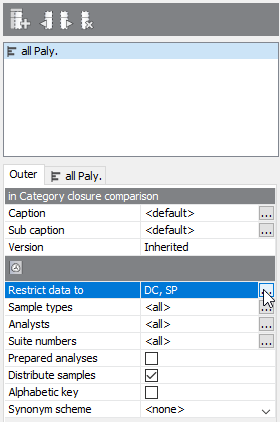
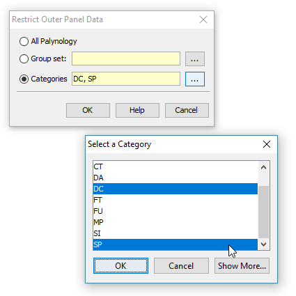
To make use of this setting, you need to select the ‘Outer’ panel properties tab, and choose ‘Restrict data to’. Here you can choose from a list of categories. To select more than one category, hold down CTRL while you select from the list.
A recap on groups and categories
All genera (and therefore species) must belong to one (and only one) category. This is a convenient way of, well, categorising taxa. Most StrataBugs users will not need to modify the standard list of categories – it would make exchanging data between databases more difficult.
Groups, on the other hand, are entirely under your control, and one species can belong to any number of groups. Groups can be attached to projects.
Both are useful for creating charts. You can find our more in the help.
More about closure diagrams
The inner panels above are created with the following options:
- ‘Group data by’ is set to ‘categories’ – this means that counts of species from the same category will be aggregated. You could also use groups here, in which case either the outer or inner panel must be filtered to a group set (which defines the selection of groups).
- ‘Plot type’ is set to ‘stacked curves’ – rather than showing the different categories in individual columns.
- ‘Calculation style’ is set to ‘relative (inner)’ which means that instead of showing the absolute count for each category, we’re showing the count as a percentage of the total for the inner panel. In this case you could also select ‘relative (outer)’ (i.e. the count is relative to the outer panel), because the inner and outer panels are showing the same data (more in this previous post).
You can find out more about the biostratigraphy panel options here.
General Relativity (‘Relative Inner’ vs ‘Relative Outer’ )
Expect the blog to feature many, many posts about the biostratigraphy panels. There are so many combinations of panel options that I shouldn’t think anybody is au fait with all of them – probably not even me! I want to start with something relatively (excuse the pun) simple. I’m also choosing this because it’s something that wasn’t possible before the new charts module was released.
My examples use data from our demo dataset. My template starts out as a simple ‘group by category’ palynology panel – that is, I’ve kept all the basic options except changing “group data by” to “category”. In the real world this would be better as groups, for which you will also need to restrict the outer panel to a group set.
Everybody should be familiar with the “relative (inner)” calculation style – it’s been in StrataBugs since the year dot. It would transform a simple absolute-abundance style plot like this:
Into a relative-abundance plot like this:
Each column shows its count relative to the total count for the analysis across the whole panel. Each row adds up to 100%. Well, OK, nearly 100% – since you asked, we’re rounding up to integer values except where we have less than 1%. Go to the full post…
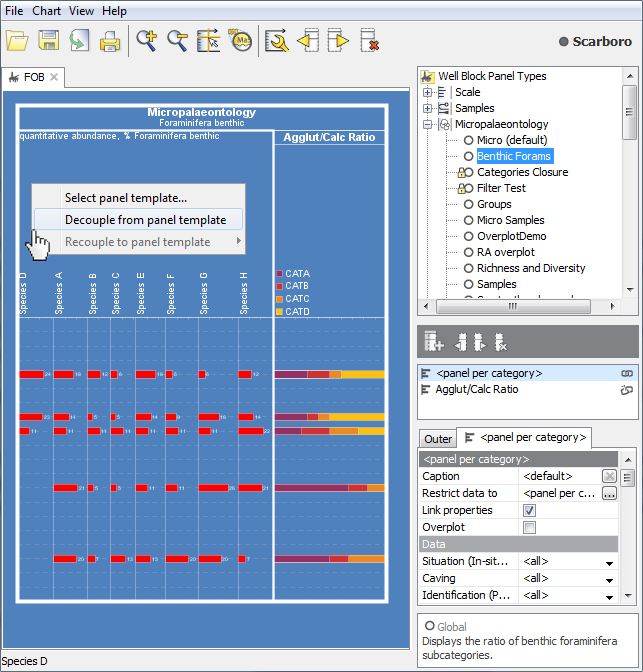
Decoupled Panel Templates
A previous comment on this blog noted “I still forget that changing something on the template I’m working on changes all the previously made charts.” I promised to address the subject of decoupled panels. I don’t want to call this a “solution” because that would imply that templated panels are a problem! It is really useful to template panels, in the right context (more on that below).
Decoupled panels have their place too. Sometimes you will want to make modifications to a panel which are very specific to one block template, project or well. Not only are you sure that you won’t need the panel elsewhere, you also want to protect it from out-of-context modification in the future.
You could “copy” an existing panel template and work with your copy. You would still need to remember not to modify it later, and it would still be clutter in your panel templates list.
Decoupling is the process of making the copied panel template “local” or “private” to a block template. The panel is no longer associated with its original template; it is not named, it will not appear in the tree and cannot be used in other blocks. If the block template is read-only then this panel cannot be edited. Its settings will be lost if the block template is deleted. Underneath, it’s still using a panel template, but for all practical purposes the panel properties become part of the block template.