Charts Keyboard Shortcuts
Did we mention that the charts are interactive?! You’ll get a lot more out of them if you are familiar with these keyboard shortcuts.
Scrolling
- Use your mouse wheel to move up and down…
- … and hold down SHIFT with the mouse wheel to go left-right.
Zooming
- Hold down CTRL with the mouse wheel to zoom in and out.
- CTRL and +/- also zoom in and out.
- CTRL and 1 zooms to the normal scale.
- CTRL and 0 (zero) zooms out so that the whole chart fits on your screen.
Magnifying
- Hold down ALT and draw a box to zoom to that area:
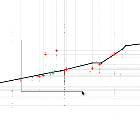
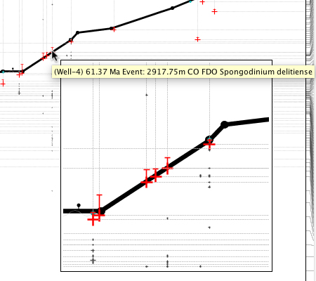
- Hold down the q key to toggle on the magnifer:
Undo and Redo
- Use CTRL+Z to undo or CTRL+SHIFT+Z to redo.

 Note – these are for undoing changes you have made to data via the chart – e.g. by dragging a node on the depth/age panel, or dragging an interval boundary. They won’t undo anything you have done via a dialog, including changing the chart properties!
General Relativity (‘Relative Inner’ vs ‘Relative Outer’ )
Expect the blog to feature many, many posts about the biostratigraphy panels. There are so many combinations of panel options that I shouldn’t think anybody is au fait with all of them – probably not even me! I want to start with something relatively (excuse the pun) simple. I’m also choosing this because it’s something that wasn’t possible before the new charts module was released.
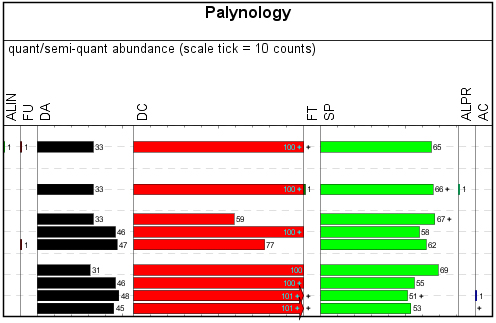
My examples use data from our demo dataset. My template starts out as a simple ‘group by category’ palynology panel – that is, I’ve kept all the basic options except changing “group data by” to “category”. In the real world this would be better as groups, for which you will also need to restrict the outer panel to a group set.
Everybody should be familiar with the “relative (inner)” calculation style – it’s been in StrataBugs since the year dot. It would transform a simple absolute-abundance style plot like this:
Into a relative-abundance plot like this:
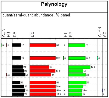
Each column shows its count relative to the total count for the analysis across the whole panel. Each row adds up to 100%. Well, OK, nearly 100% – since you asked, we’re rounding up to integer values except where we have less than 1%. Go to the full post…
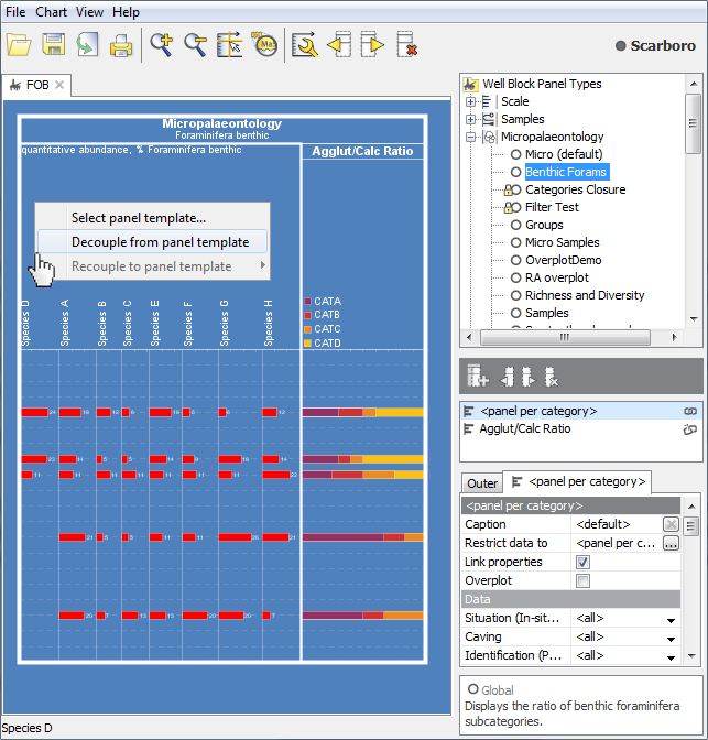
Decoupled Panel Templates
A previous comment on this blog noted “I still forget that changing something on the template I’m working on changes all the previously made charts.” I promised to address the subject of decoupled panels. I don’t want to call this a “solution” because that would imply that templated panels are a problem! It is really useful to template panels, in the right context (more on that below).
Decoupled panels have their place too. Sometimes you will want to make modifications to a panel which are very specific to one block template, project or well. Not only are you sure that you won’t need the panel elsewhere, you also want to protect it from out-of-context modification in the future.
You could “copy” an existing panel template and work with your copy. You would still need to remember not to modify it later, and it would still be clutter in your panel templates list.
Decoupling is the process of making the copied panel template “local” or “private” to a block template. The panel is no longer associated with its original template; it is not named, it will not appear in the tree and cannot be used in other blocks. If the block template is read-only then this panel cannot be edited. Its settings will be lost if the block template is deleted. Underneath, it’s still using a panel template, but for all practical purposes the panel properties become part of the block template.
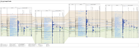
Organising Blocks in a Multi-Well Chart
Creating multi-well charts from projects is a simple matter of dragging and dropping your chosen block template (if you aren’t sure, visit this page). Here are some tips for organising and arranging blocks once they are in your chart.
Order
When you “drop” the well block template onto the chart, the block import dialog gives you some ordering options. To take advantage of location-based ordering, you must enter latitude/longitude values by editing wells in the Wells & Outcrops module.
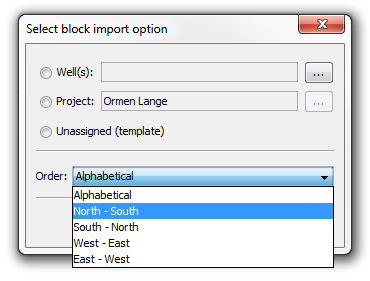
You can access the same options later by right-clicking anywhere in the chart and choosing “Re-order well blocks”. This retains each block’s properties (whereas deleting the blocks and adding them again would not) – so you can quickly experiment to find the most appropriate order.
Spacing
The area between blocks separates them visually and is also where correlation lines will be drawn. To control the amount of space, open the Chart Properties dialog ![]() and set the “Between blocks” value on the Dimensions tab.
and set the “Between blocks” value on the Dimensions tab.
For those who have used the legacy charts – this replaces the functionality of the “blank panel”. You can use the “Blank” panel template type to create space within blocks.
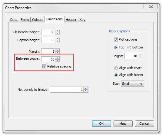
You could also take advantage of the “Relative Spacing” option. This uses the well coordinates to give an indication of physically how far apart the wells are. The values are calculated by scaling the straight line distance between adjacent wells so that the average distance between all blocks is equal to the “Between blocks” value. If there are no well coordinates for the block, the “Between blocks” value will be used. The gaps will be no larger than five times the average and no smaller than one fifth of the average. This allows you to compare wells on eastern and western margins for example, while ignoring the current sea bed between. You can enter latitude/longitude values by editing the well in the Wells & Outcrops module.
Depth Ranges
You can manually change the depth range for each block by typing in the block properties table -which could be a tedious job if you have lots of wells!
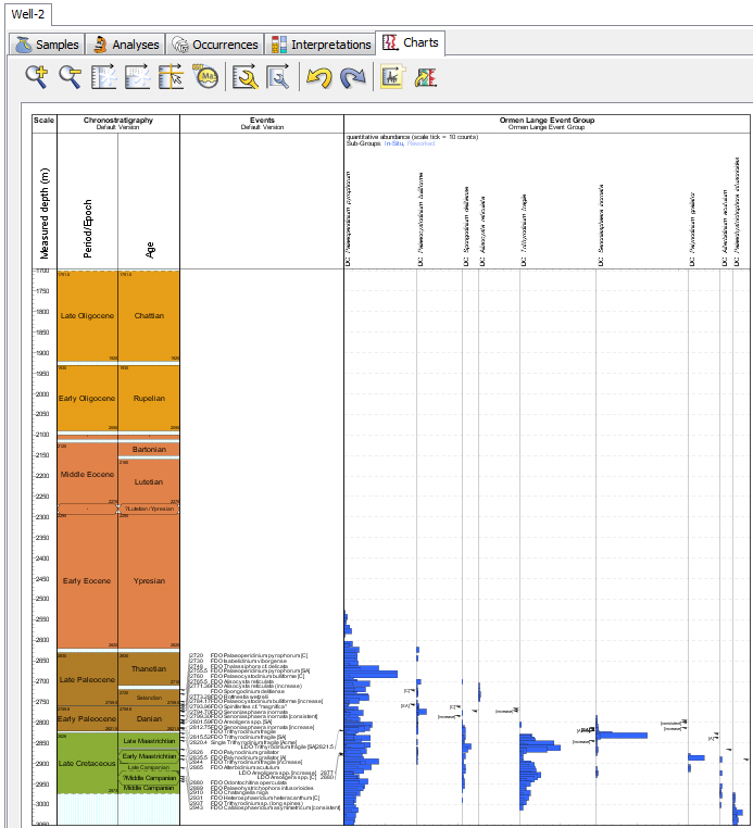
It can be easier (and more useful) to select the depth range based on some data you are displaying. Right-click in any panel and choose “Snap block depth to panel content” to use the data range of the panel as the block’s depth range (e.g. for an events panel where the first event is at 2730m and the last event is at 2849m, the block depth range will be set to 2730-2849).
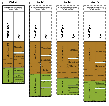
An even better way to use the data is to select the range for all blocks together by choosing intervals or events as “data boundaries”. Right-click anywhere and choose “Select depth range for all well blocks”:
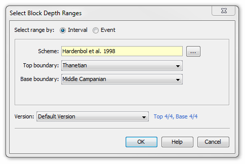
Now you can choose intervals or events which will define the depth range for all wells. The text in blue shows how many of the wells in your chart have data for the selected boundaries (other well blocks’ depth ranges will not be changed). This is a convenient way to select an area of interest for all wells, which you can later refine as necessary. As long as you remembered to save your chart before you started, you can use “Chart > Restore saved properties” to “undo” your changes.
Variable Scale Sections
This is an old chestnut: you want to show different sections of your chart at different scales. The big picture is important, but most of the detail is in one small part. Thankfully you can now have your cake and eat it, by setting up scale sections.
Here’s one such example, where it would be nice to see the detail around the section of event picking without losing the overall chronostratigraphic picture.
To do this, we need to bring up the block properties.
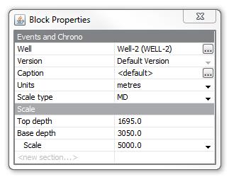
Now we can type a value into the last row on the table (“<new section…>”). The first event is at 2720m, so we’ll start the new section just above, at 2710m.
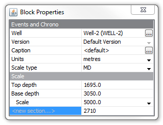
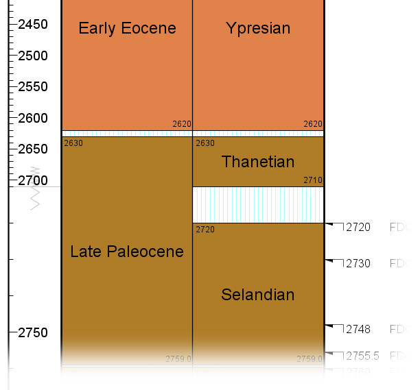
Now press enter, and we have a new scale section for the lower area of the chart, which has its own scale value. With a few tweaks, we can get a lot more data into the same size chart:
A symbol in the depth scale panel indicates that there is a change in scale:
You make as many scale sections as you like – just keep adding them in the same way. To remove a section, increase the range of the section before or after it such that it completely covers the unwanted section.
Templates: How Many Is Too Many?
As the early adopters get into the swing of the new charts module, we’ve heard a mumble or two about the quantity of templates being created. A big advantage of the new charting system is that it can cut down on duplication; if you wanted to use the same panel design twice, why store (and have to edit it) twice? Now that you can share templates across charts, you don’t need to store so many! But because you can see these templates on-screen, it could appear that you have more, rather than fewer.
How many do you have? Just how many is too many?
The number of templates you need depends entirely on how you work. Having lots of templates is fine… But perhaps you have a template management problem if:
- You can’t find the template you’re looking for
- It’s not obvious what templates do
- You have many templates which are similar and/or unused
These problems are all easily avoided by taking note of a few points.