Claim your StrataBugs ID
Today we introduce an exciting new feature: an online register of StrataBugs users. It sounds simple – and for you, it is!
All analytical data in StrataBugs is linked to an analyst, who has a name and an ID (usually their initials); the idea being that you could identify who created particular sets of data, and possibly even interact with them in the real world. Anybody who imports data must deal with “matching” analysts – that is, linking their information in the file with some details in your database. This is relatively easy with the newer SBG files because they always contain the analyst’s name. However, there are lots of files out there in many different formats which don’t contain anything more than an ID. Even in the relatively small community of biostratigraphers, we don’t all know each other. This can make matching analysts an uncertain process. Add to this the problem that different people may have the same initials, and things get very tricky indeed.
Our new web services project tackles this situation by giving you the opportunity to “claim” your StrataBugs ID. Anybody else using StrataBugs will be able to link a file with your ID back to you. Plus, newbie biostratigraphers won’t be able to “steal” your ID!
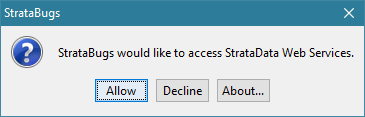
When you next log in, you’ll get the opportunity to opt in or out of using our web services.
If you accept, StrataBugs will check the online register to see whether your StrataBugs ID is registered. If not, you’ll get the opportunity to add it. If it is already registered, but not to your name, StrataBugs will suggest that you change your ID! If you or your system administrator changes your name or ID via the User dialog, your online record will also be updated.
Note that the only way to register your ID is for you to log in. No other user can do it for you.
Now when you are matching analysts from a file, you see a “lookup” button. This checks the register to see if there’s a match against the analyst ID.
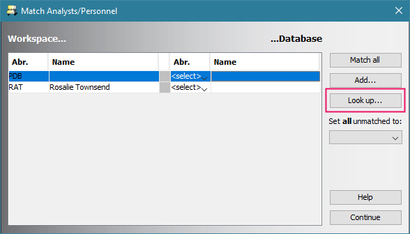
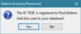
In this case, there is, and you’ve got the option to add him as an analyst in your database.
In the interests of transparency, this is all the data we are collecting:
- Your StrataBugs ID
- Your full name
- Your discipline
- An optional link to a web page of your choice (personal website, LinkedIn profile etc)
- The date on which you last logged in to StrataBugs (this is so that we can detect unused accounts and delete them if necessary)
So – download the update (from test) and get claiming your ID before somebody else does!
Adding new zones from a chart
We try to make it as easy and ‘safe’ as possible for you to explore StrataBugs without inadvertantly corrupting your data. That’s why we always ask you to confirm before deleting something. Last week we were clicking about in this way (exploring), trying to think through an idea, when we stumbled upon a feature that we’d completely forgotten was there.
A helpful user had made a great suggestion. In their own words:
Being able to add interpretations (e.g. chronostrat) via the charts in the Samples & Interpretations module would be a very useful addition, rather than having to keep switching tabs back and forth.
The thought process on our side goes something like this: Well, yes, that would be good! How would that work? Double-click somewhere? There’s already some double-click action in the zones panel (*try double-clicking in a zones panel*) – you can edit existing zones by double-clicking on them. So, maybe double-click where there isn’t a zone? (*double-click where there’s no zone*) Hey, look, it brings up the interval dialog! So we already implemented this! (*try the same on another panel*) Oh dear, doesn’t seem to work in this panel, why’s that?
There are, literally, millions of lines of code in StrataBugs. It’s not surprising that we forget about some of them.
Go to the full post…
Time moves on
Another year, and it comes to our attention that another new geological time scale is published in the form of GTS2016. This new work makes some 27 changes to stage boundaries compared to the previously published GTS2012. We have taken this opportunity to revisit our interpretation of the 2012 time scale and provide a 2016 version which shows the revised stage boundaries, and the resulting changes to the divisions further up the hierachy. We have also added more subdivisions where these didn’t exist before, e.g. the sub-epochs in the Cenozoic.
Because this new 2016 scheme has been created in StrataBugs v2.1, we have been able to add the boundary uncertainty indicator so you can see which are confident, probable or possible.
Users of Timescale Creator Pro may be able to import the new schemes directly from the data pack, but we have packaged the revised timescale so you can download your own copy and easily import this into StrataBugs. If you use the “Read…” button in the Schemes and Interpretations module, you can compare the new scheme on the Match Scheme dialog with the existing GTS2012. The match dialog shows you exactly which changes have been made: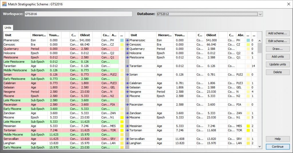
As usual, items in the workspace are on the left, and existing items from the database are on the right. Green rows indicate the new units. Red rows show where there is some kind of difference. Many of the differences are where we have added further precision to the boundary ages.
Once you’ve imported the new scheme, you will need to ensure that zone boundaries in your existing zonation schemes are in alignment with the updated time units. You can get StrataBugs to do the bulk of the work for you using the “Recalibrate…” button. This will create a copy of your scheme with zone boundaries adjusted in the same propoprtion as the change in the corresponding time unit from one scheme to another.
You can also relink existing well data intervals to a new scheme using the “Reassign…” button on the “show wells” dialog for the existing scheme. This procedure looks for units of the same name in the new scheme, and switches the well data to point to the new scheme. For a transition between GTS2012 and GTS2016 there should be a complete match of unit names. The implication of the reassignment is that the unit positions will change when plotting depth/age curves, so your depth/age curves might also need revisiting if you switch to the new time scale.
Unless you are actually using the time to calculate accumulation rates, or measuring time gaps in Wheeler diagrams, or exporting curves into another system, it doesn’t really matter which time scale you use; as long as all your schemes are consistent with it, there is no ambiguity as to which stratigraphic unit zones or events belong to. It is for this reason that in v2.1 you must specify which time scale a zonation scheme belongs to. You can also group the display of schemes according to the base chronostratigaphic scheme.
Event Confidence
Confidence levels for events are a new feature for v2.1. You will be more sure about the position of some events than of others. A strong flood of specimens makes a more definite marker than a single, poorly preserved top. Can you be sure you have located the relevant abundance peak? If you are going to base other interpretations on event picks (especially a depth/age curve), then you will want to give yourself some guidance as to the reliability of those picks. Here I will demonstrate the ways you can apply confidence to events in order to give yourself this support.
Events in wells
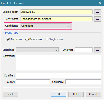
To change the confidence level for a well event, select from the drop-down in the Event dialog:
You can set the events panel to display less confident events in a lighter colour.
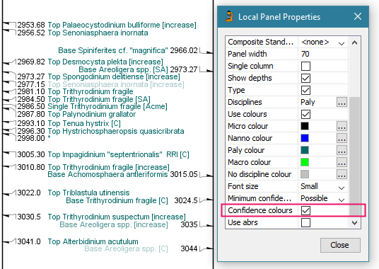
Don’t forget that you can display events on your taxon distribution chart (for example, download the “Event Age” panel template from here). This is handy for deciding on the confidence level – you can easily spot the more dubious events and designate them accordingly. You can double-click on an event to edit it. In this panel, the colour changes where the event is picked. The colour change is more pronounced where the event is more confident.
Events in time (composite standard events)
Composite standard events are configured and displayed in much the same way. The stratigraphic range panel shows ‘probable’ events with a dashed line and ‘possible’ events as a dotted line.
Cross-plot of events (depth/age chart)
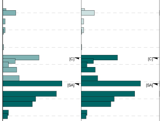
On a depth/age chart, confidence levels of both types of event help you when placing your curve. Events are shown with a lighter-weight line when their age is less confident, and a lighter colour when their depth is less confident.
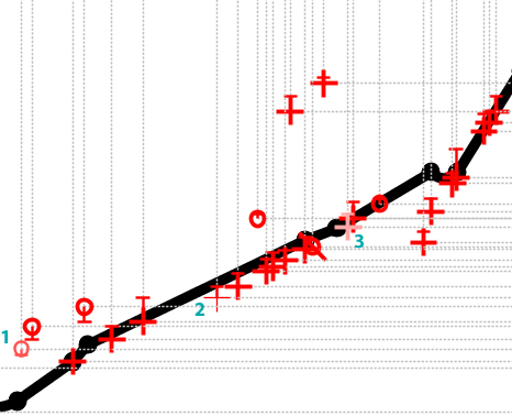
Note that the confidence is subjective: it’s not based on data from adjacent samples. The event depth range “tails” are based on the next analysis within the discipline under the assumption that, for instance, a top event could extend right up until the next sample, and vice versa for a base.
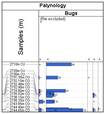
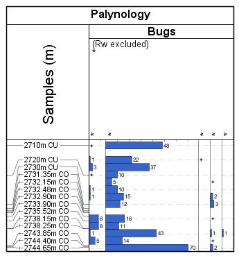
Abundance Events in Stratigraphic Range Charts
In recent weeks we’ve been busy enhancing the stratigraphic range chart plot to display abundance events. Many thanks to Martin Pearce at Evolution Applied for working through this with us.
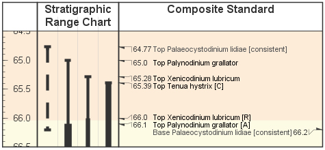
The stratigraphic range panel is designed as an alternative type of view on a composite standard (event scheme). It shows the ranges of events in time.
A note on terminology: the ‘range chart’ I will be referring to is different from a ‘species distribution chart’ showing abundance variations in a well section – which I do often hear referred to as a ‘range chart’. The range chart in question is concerned with time.
A simple range chart showing a few species might look like this:
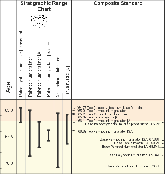
Events relating to the same species are grouped together. In this case there are three events for Palynodinium grallator – a total species range, plus two abundance event ranges.
At the moment there is no formal way to link these abundance events (denoted by the [A] and [SA]) to an abundance scheme which defines them. A simple workaround is to create an abundance scheme with exactly the same name as the composite standard. The stratigraphic range panel will pick this up and use it to identify abundance events. Any term abbreviation from the abundance scheme which appears in the event name surrounded by brackets (you may use parentheses, square or angled brackets) will be interpreted as an abundance event. Go to the full post…
Overplotting Biozones
Over the past few weeks we’ve been polishing a new feature for “overplotting” biozone panels. This feature gives you more flexibility over which biozone schemes you can include in the same columns. It was something we allowed for in the v2.1 data model but hadn’t got around to implementing yet. And yes, I am aware that “overplot” isn’t officially part of the English language, but it does describe the concept quite succinctly!
Hopefully you are already aware that:
- Biozone intervals are always linked to a scheme.
- Biozone schemes are linked to a discipline.
- There are four panel types for biozones: one for to each discipline.
- A biozone panel in a block template has a scheme attribute. When you add a panel template to a block template, you can either:
- Choose one scheme belonging to the panel’s discipline, or
- choose no scheme (“<panel per scheme>”), in which case you will see all of the intervals linked to schemes with the panel’s discipline, either merged into one column or as separate, automatically generated panels.
In short, this means you could either select all the schemes for a discipline, or one scheme only.
Adding the overplot function makes things much more flexible, giving you complete control over which intervals will appear in which columns, and even allowing you to mix disciplines. It is a simple technique (on your side anyway!) which tells one panel to draw on top of the previous panel. Go to the full post…
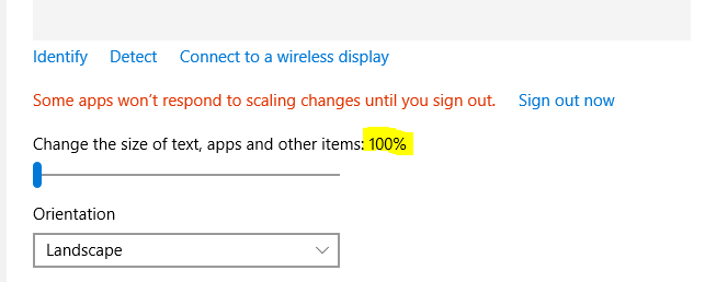
Why doesn’t StrataBugs always look right?
You get a shiny new computer with a nice high resolution screen but when you start up StrataBugs, the text font looks too small so you can hardly read it, and some windows are clipped so you can’t see everything that’s supposed to be there without enlarging it. Moreover, every time you get a simple dialog box pop-up, the icon, instead of looking like this:
 (Windows 7, 100%)
is clipped, like this:
 (Windows 10, 125%)
So, what’s going on? Well, it’s possible in Windows to set your display preferences so that text fonts and other windows components are made larger and more readable, without sacrificing the overall number of pixels available on screen (unlike, say, lowering the overall screen resolution, which doesn’t look good on modern flat screen monitors). As higher resolution monitors have become the norm, the default settings on a new Windows installation is actually for this preference to be set to 125%, so you might already have enlarged text without realising it. The problem is that a lot of software, and this includes the Java library code that StrataBugs uses, doesn’t respond in a uniform way to the font size change, resulting in the general loss of beauty described above.
In general, if you’re running a recent update of StrataBugs, you will have seen that the text is reduced in size compared to the general Windows font sizes, so that the text and other components fit into the StrataBugs windows as they are designed. Older builds (including v2.0), will have parts of some of the dialogs missing, where the window is too small to accommodate the enlarged controls. We’ve been tweaking things again recently, to get around the tiny menu font sizes and the clipping you see above, which makes life a bit easier on the eyes.
We would also recommend that you don’t opt for the ultra high resolution 4K screens for Windows, as the application will look tiny, however this doesn’t affect the Mac community, as the scaling for their Retina displays is already built into the libraries. We’ve always bemoaned the lack of pixels available on standard issue laptops with a resolution of 1366 x 768, which is the bare minimum of space you need. More pixels are definitely better, as long as you can still read it.
The best solution, for now, is to right-click on your desktop background, select Display Preferences and reset the size to 100% ….
You might find this a bit tricky to start with, but you might also like the extra screen “real estate” that this gives you. If after a while you still find yourself squinting at the screen, try moving your chair closer, or visit an optician and invest in a new pair of glasses!
Why are my analyses plotting at the wrong depth?
A couple of people have stumbled over this one in recent weeks. No “bug bounties” I’m afraid folks – this behaviour is intentional. Honestly, it’s not a bug, it’s a feature!
In a high precision study, you may have analysed many samples within a small depth range. If the occurrence data were plotted at the exact analysis depth, then all the histograms and labels would plot on top of each other.
This can make it difficult to see the finer detail. In order to get around this problem, we ‘distribute’ the analyses into the surrounding empty space, such that each data point is readable.
Sample Depth Precision
Possibly the most frequently asked question we are asked is “why do my samples show with different numbers of decimal places?”, or “where are the decimal places on my cuttings?”. StrataBugs charts have always displayed the different sample types with precision which reflects the nature of the sampling. Cuttings samples show to the nearest whole metre (or foot) because it would be misleading to suggest the depth was any more precise than that.
Here’s the full information for all sample types:
| CU | cutting | nearest whole metre or foot |
| SC | sidewall core | 1 decimal place |
| CO | core | 2 decimal places |
| OC | outcrop | 2 decimal places |
| LOG | log pick | 1, 2 or 3dp – configurable by super-user (Control Panel > Config > Default samples depths) |
This affects the charts and wherever samples are displayed along with their type and label in the data tables. The position of samples is still determined by the depth you give them (and which, in the case of cores (and optionally cuttings) may be affected by core shifting).
These levels of precision follow an industry convention used since version 1.0 of StrataBugs. One drawback is sometimes where you have a well originally drilled in feet and now dislayed in metres, where you would like to show the cuttings depths to 2 decimal places to reflect the converted number. You can do this in the Samples panel by checking off the “Display symbols” option in the panel propeties.
Within the database itself, all sample depths are stored in metres to at least three decimal places (dependent on the database type).
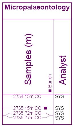
When is an analysis barren?
Analyses may be ‘prepared’ (yet to be analysed), ‘analysed’ (contains occurrences), or ‘barren‘ – indicating that they have been analysed but found to contain no taxa.
When we reviewed and tightened up all aspects of the way the biostrat data were stored in v2.0, it seemed sensible to enforce that analyses marked as barren did not contain occurrences of microfossils. Therefore the only option when clicking the barren flag was to clear all the occurrences. It’s been pointed out to us since that analyses can contain accessory minerals or perhaps caved taxa, while still technically being barren of microfossils.
The most recent test update will allow you to have your cake and eat it – you still get the option to clear the occurrence list, but you can have some analysed data while the analysis is marked as barren. This doesn’t require a change to the underlying data model, and any data files exported will reflect what you have on screen. The only caveat is that if somebody without the update imports the file, their analysis will not be barren.